
This morning, we are excited to announce the launch of our new, simplified KMB architects logo. Our firm has grown much over the past few years and we believe it’s time for a change.
We wanted to make sure the core of our brand remained the same, while at the same time reflecting the firm that we are today. We looked to the history of our firm for inspiration - incorporating themes from different logo designs throughout the growth and development of the firm. The culminating design is both a step forward in the evolution of the KMB architects brand and a simplified design that takes us back to our firm’s roots.
Founded in 1987 by Kenneth M. Bensimon and originally known as KMB design-development, the name and graphic representation of our firm has evolved many times over our 35 year history. Below is a brief history of the “KMB” and our journey throughout the years.
The first logo(s)
One of the first logo designs is immortalized on a coffee mug, stored in the office of our Business Manager. The mug features the first critical branding element: the stylized letters KMB.

The “KMB”
is the core of our logo, the stylized element most prominent since the very first design.
2003-2015
There are variations of similar concepts, all of which feature the emphasized “KMB.” Utilitarian in concept, original branding served the purpose of identifying KMB, but did little to set us apart.

The firm was renamed KMB Design Groups to highlight the expertise of the firm in various project types. Gray blocks first appeared around 2003, accompanying the “KMB” - now redesigned and depicted in blue.
Future iterations of the logo added color and further developed the graphic elements of the “KMB,” including a varied number of blocks and text locations. This is the first introduction of key font, Arial Narrow, which is used throughout our standard project documents and meeting minutes.
2016 - Present

In 2015, KMB Design Groups became KMB architects. The logo design remained mostly unchanged, through architects replaced Design Groups and found its place below the gray blocks. The number of gray boxes became standardized for all logo appearances as well.
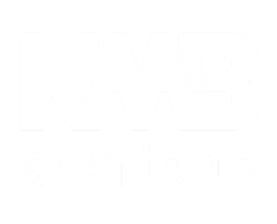
Today

We are excited to announce the next step in the evolution of the KMB architects brand, an updated homage to the very first logo. We preserved the core of what it means to be KMB architects and focused on creating a streamlined, simplified look to represent our firm.
You will notice the new logo on our website, social media platforms, email signatures, and more. As you can see, it’s pretty similar to our old logo, only simplified. The gray blocks, which felt as if they crowded out what was most important, are no longer. The dimensions of the new logo make it easier to use, and the new design is focused on the colors and identifiers which are most critical to our brand identity.